1. A design “detox”
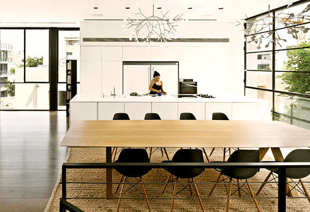
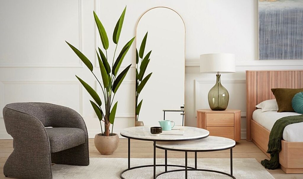
Design can be as detoxifying as juices! Design “detox” is actually a minimalist concept, touching both organization and decoration. It was created as logical style for a healthier life by offering a space that is free of clutter, allowing for better concentration while making housework and moving around easier.
As a general rule, a very simple colour palette is used. The most famous wallpaper and paint brands are shifting towards calm and soothing shades for 2016. The colder grays are giving way to warmer hues. Sherwin-Williams has announced its colour of the year: Alabaster SW 7008, a shade symbolizing new beginnings; while Benjamin Moore chose Simply White OC-117. We are literally in a comfort zone, a remedy for time that goes by too fast!
2. A unisex palette
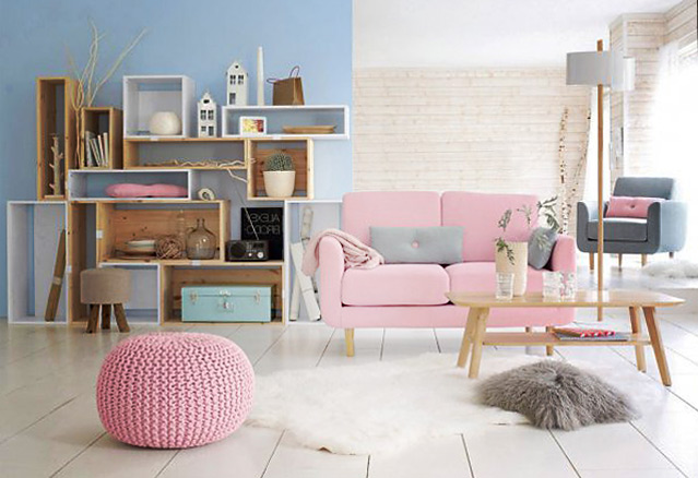
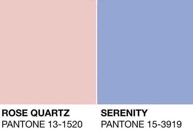
Pantone, the world authority for all things colour, surprised the design community by choosing not one, but two 2016 colours of the year! The first is Rose Quartz (Pantone 13-1520), a playful, persuasive and soft shade. Light and airy, like the expanse of the sky, second-colour Serenity Blue (Pantone 15-3919) evokes calm and comfort and offers a feeling of rest, even through chaos. These two colours that are now known and recognized by the world may seem soft and childish. However, according to Pantone, they were chosen in a rather interesting light, in line with the current social movements that are fluidly shifting towards gender equality. Interesting, right?
3. Warmer Metals
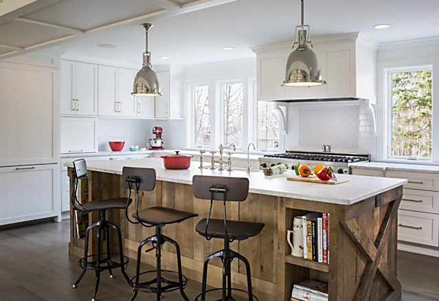
Particularly in spaces like the bathroom and the kitchen, rose gold, brass, copper, and gold will dominate the metal world in 2016. These warm-shaded metals offer double the charm when they are paired with raw materials such as marble and wood. This being said, we are not putting brushed or chrome silver asside! Mixing the different shades and finishes gives beautiful results. So no need to change all your metallic elements to be trendy! Start with a light fixture and a few decorative elements. To find the first new items to include in your decor, I strongly recommend a visit to ITEM.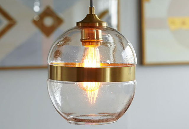
4. Raw Materials
We have been including raw materials in home decor for some time now, but in 2016, the possibilities are infinite as they easily suit all styles. The instant aging of raw materials gives character to a space, no matter its style. They also add some texture and ruggedness to sterile environments; all the while bring an unexpected touch that intrigues the senses. When we think of raw materials, we often think of architectural materials such as wood, steel, and concrete... But with a bit of creativity, we can use them in all sorts of ways, whether it be in a piece of furniture, a light fixture or a wall treatment. Be sure not to go over-the-top by respecting the desired style and ambiance. With my cabinetmaker Antoine Rondeau, who specializes in raw materials like hardwood and steel, you can create amazing and unique pieces. A large table or a small bench – the charm is immeasurable.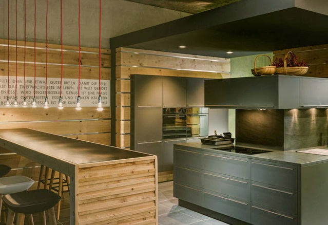
5. 70’s inspiration
The seventies are back in style! The free-spiritedness associated to that period was very inspiring to the design industry. Many design elements from the 70’s were made popular around the world. The style of that decade, also known as retro, is known for its dynamic curved lines, flashy colours, plastics, geometric and floral patterns inspired by hippy music and style.You can find many 70’s-inspired pieces at West Elm. [caption id="attachment_3291" align="alignnone" width="639"]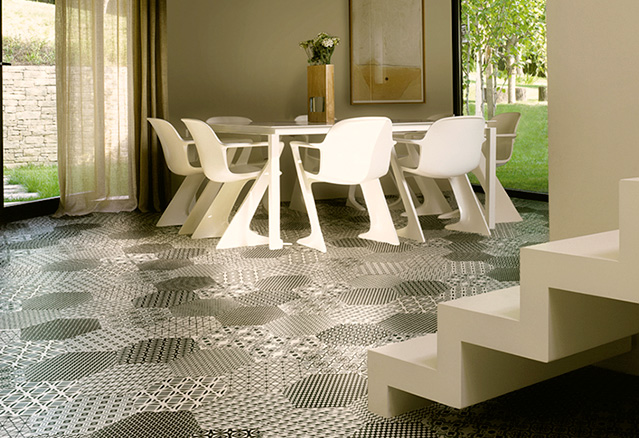
Why not try a statement piece and indulge in this wonderful tile from the St-Barth Collection by Céragrès?[/caption]
6. Black Steel
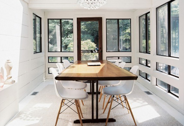
One of my favourite decorating trends for 2016 and one of this year’s favourites is black steel! It comes in all shapes and sizes and can be found as much in outdoor as in indoor architecture, furniture and accessories. It’s mostly used in small quantities, forming thin linear shapes to give an effect of stability and lightness, which balances out our totally opposite lifestyles. I also LOVE black-steel window frames. Boldly highlighting natural light: the best way to bring the attention to one of the most important features in your house! Instead of changing your windows, stemming from the same idea, why not go for a wall with different styled frames? Black-steel elements will make your most beautiful memories shine. This year, black steel is even more popular in detoxed decors, but it can also be a part of other more classical, modern, eclectic or industrial styles. For low-budget decorating accessories, visit boutique Zone maison.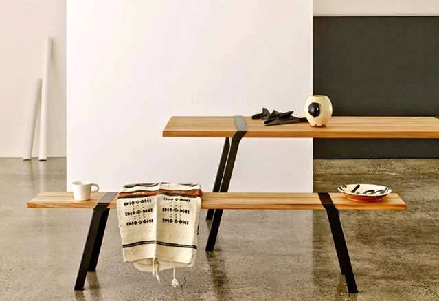

7. Tailored furniture
Our lifestyle encourages us to choose furniture according to our needs. Although multifunctional furniture isn’t anything new, we have been hearing much less of it lately because of its costly reputation, but think again! It isn’t necessarily more expensive than prefabricated furniture when you look at the price versus the quality, and it’s made RIGHT HERE, IN QUEBEC! One single piece of furniture could answer all your prayers: an outlet to charge your tablet, integrated lighting for reading, a hidden garbage can or specific storage... On top of choosing what it does, you can also pick its size, the materials, and hardware! Modular units such as tables, wardrobes, and sofas are very popular since they can be customized according to your needs... And when a piece of furniture suits your needs, you are more likely to keep it longer. Are you thinking of a design project or simply interested in custom-made furniture? Contact me! I’ll assist you from creation to production.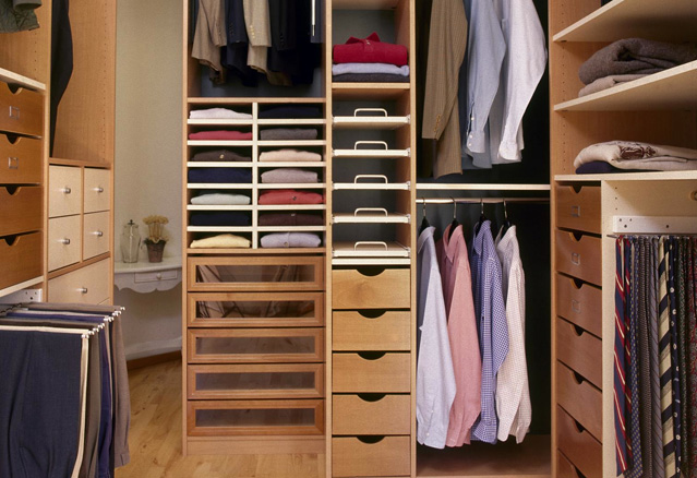 Are you thinking of a design project or simply interested in custom-made furniture? Contact me! I’ll assist you from creation to production.
